ggplot2 - A Strong Package Used in Data Visulization
ggplot2 is an R package created by Hadley Wickham. It has a great use in statistical data visulization. I got in touch with it in the first year of my graduate study and I had so much fun presenting statistical plot with the help of ggplot2! However, there are so many aesthetics and parameter settings in this package, and it is easy to mixed up. ggplot cheatsheet is always ready for help. I decided to summarise the most common used aesthetics of ggplot2 as well as how to make a qualified plot in statistics. Hope you may find this blog useful!
Practical thins to make a plot better
There are 8 criterions one has to meet in order to make a plot better:
• Label the axis
• Have a title
• Make sure the title and axis are large enough
• Label the plot or have a legend
• Text on plots is great
• Use color and fill effectively groups
• Don’t make a plot overly complex – make two plots
• Get rid of non-essentials
Common used aesthetics
Geom
• geom_point()
• geom_smooth()
• geom_boxplot()
• geom_bar()
• geom_histogram()
• geom_density()
• geom_linerange()
• geom_text()
• geom_curve(x = , xend = , y = , yend = , arrow = arrow(length = unit(0.3, 'cm ')), curvature = 0.5)
• stat_function()
Tips: if the variable is not continues, use bar graphs to display the distribution of categorical variables instead of histogram or density plot.
THEME
• theme(axis.text = element_text(),
       axis.tltle = element_text(),
       plot.title = element_text(),
       legend.position = ,
       legend.title = element_blank(),
       axis.text.x = element_text(size = 10, angle = 90, hjust = 1, face = 'bold')
• ylab(')
• xlab()
• ggtitle(')
GUIDES & LEGEND
• guides()
• ylim()
• coord_trans()
• coord_flip()
• scale_y_continuous()
• scale_y_discrete()
• scale_color()
Tips: The only difference between coord_trans() and scale_y_continuous() is where the tick marks on the axis are drawn (scale_y_continuous has the tick more evenly)
FACET
• facet_wrap(~, nrow = )
• facet_grid(~, labeller = label_both)
COLOR
• RColorBrewer library(RColorBrewer)
display.brewer.all()
g + scale_fill_brewer(palette = ‘Accent’, ‘Dark2’)
• wesanderson library(wesanderson)
ag + scale_fill_brewer(‘Zissou1’)
g + scale_fill_manual(values = wes_palette(n = 3, name = ‘Zissou1’, ‘FantasticFox1’))
Examples
ggplot is so powerful a tool that one can recreate almost any plot with R. Here is an excellent blog post from Rafa Irizarry on how to recreate plots using ggplot2 from blog Simply Statistics.
On Data Science class, we recreated a plot from a FiveThirtyEight blog. That interesting experience shows how useful ggplot2 is and I am writing this blog to show how we recreate that plot.
Data wrangling
We used the make_babynames_dist() function in the mdsr package to add some more convenient variables to our dataset and to filter for only the data that is relevant to people alive in 2014.
BabynamesDist <- make_babynames_dist()
head(BabynamesDist)
## # A tibble: 6 x 9
## year sex name n prop alive_prob count_thousands age_today
## <dbl> <chr> <chr> <int> <dbl> <dbl> <dbl> <dbl>
## 1 1900 F Mary 16706 0.0526 0 16.7 114
## 2 1900 F Helen 6343 0.0200 0 6.34 114
## 3 1900 F Anna 6114 0.0192 0 6.11 114
## 4 1900 F Marg… 5304 0.0167 0 5.30 114
## 5 1900 F Ruth 4765 0.0150 0 4.76 114
## 6 1900 F Eliz… 4096 0.0129 0 4.10 114
## # … with 1 more variable: est_alive_today <dbl>We filtered the data so we only have babies with the name Joseph who are male.
joseph <- BabynamesDist %>%
  filter(name == 'Joseph' & sex == 'M')
Data visualization
We ploted the number of Joseph’s born each year who are estimated to be alive on January 1, 2014. We will get that estimate by mutiplying the number of Josephs born in a year by the probability that a person from that year will be alive on January 1, 2014. We added the line for the number of Josephs born each year to our plot
name_plot <- ggplot(data = joseph) +
geom_bar(aes(x = year, y = count_thousands * alive_prob),
stat = 'identity', fill = '#b2d7e9',
colour = 'white') +
geom_line(aes(x = year, y = count_thousands),
lwd = 1) +
ylab("Number of People (thousands)") +
xlab(NULL) +
theme(axis.title = element_text(size = 16,
face = "bold"))
name_plot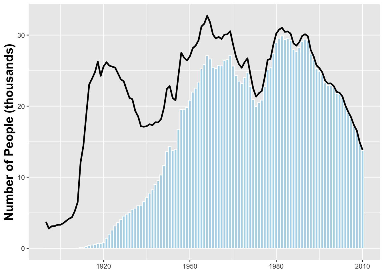 Next we need to add a darker blue bar indicating the median year of birth for a Jospeh alive on January 1, 2014.
median_yob <- with(joseph, wtd.quantile(year, est_alive_today, probs = .5))

name_plot <- name_plot +
  geom_bar(stat = 'identity', color = 'white', fill = '#008fd5',
           aes(x = year, y = if_else(year == median_yob,
                           est_alive_today/1000, 0)))
name_plot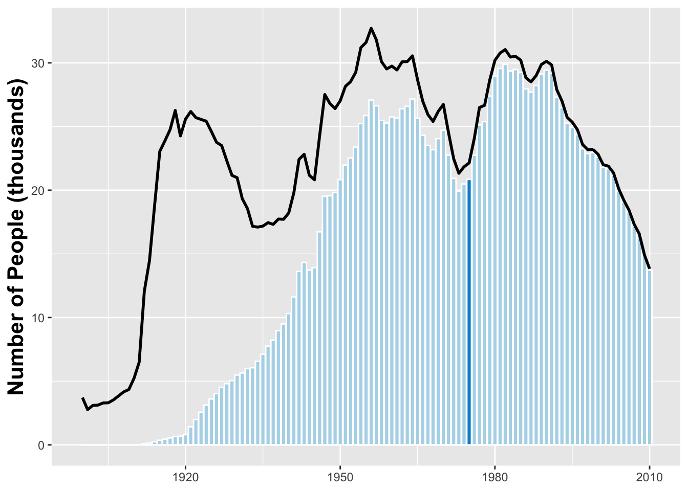
Finally we updated the axis labels
name_plot_2 <- name_plot +
ggtitle("Age Distribution of American Boys Joseph") +
geom_text(x = 1940, y = 30,
label = "Number of Josephs \n born each year") +
geom_text(x = 1929, y = 12,
label = "Number of Josephs \n born each year
\n estimated to be alive", colour = "#b2d7e9") +
geom_text(x = 2003, y = 37,
label = "The median \nliving Joseoph
\n is 37 years old", colour = "darkgray")+
geom_curve(x = 1995, xend = 1974, y = 37, yend = 24,
arrow = arrow(length = unit(.3, "cm")),
curvature = .5) + ylim(0, 40) +
theme(plot.title = element_text(size = 22))
name_plot_2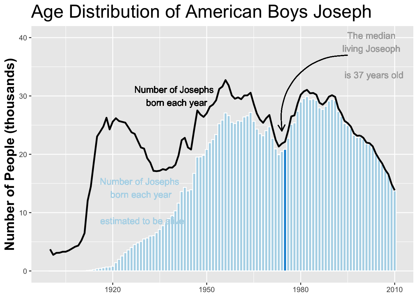 We can also change the name to “Jessie” and the sex to “female”
name_plot %+% filter(BabynamesDist, name == 'Josephine' & sex == 'F')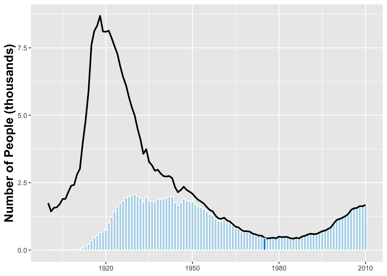
Tianran Zhang
A professional data scientist, an unprofessional hiker, cooker, video creator, day dreamer, and life-long learner.
sad().stop(); beAwesome();